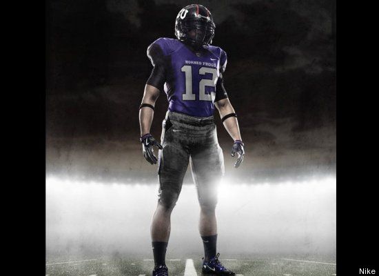
 The person who did was Texas Christian's equipment manager, who came up with this look. The front of the jersey says "Horned Frogs", inside the collar says "Don't Back Down". There are two red lines on the helmet, representing the twin streams of blood a horned frog shoots from its eyes as a defense mechanism. And, of course, there's the incredible charcoal gray pants - a highly underutilized color in uniforms, I think. For comparison, compare the new uniform at left to TCU's old uniform. It's not even close.
In fact, the change was so good that TCU's coach gave a game ball to the equipment manager who designed the new unis.
I'm not usually a fan of changing MSU's traditional home uniform (green shirt, white pants, green helmet with the Spartan logo) too much, but I am one of those Spartan fans that doesn't mind a third color in the black/gray scheme - and wouldn't mind us trying those charcoal gray pants.
MSU's men's basketball squad occasionally rocks the newest Nike designs - those tight-hugging shirts for example - and while sometimes they'll have a few nice features, you'll never look at the jersey and go "whoa."
Perhaps that kid from TCU would be free to lend a hand on a new design.


No comments:
Post a Comment